One-Sentence Definition
Pantone Color Matching is a standardized system that enables designers, manufacturers, and printers to accurately specify and reproduce colors across different materials and production processes using unique Pantone codes.
Detailed Explanation
The Pantone Color Matching System (PMS) is recognized worldwide as the universal language of color. Developed by Pantone Inc., it assigns unique codes to thousands of colors, allowing precise communication and reproduction of colors across industries—from printing and packaging to plastics, textiles, and signage. Unlike the CMYK process, which creates colors by overlaying four inks, Pantone colors are premixed and referenced by a specific code (e.g., Pantone 186C), ensuring consistency and accuracy regardless of where or how the product is made (Pantone).
Pantone’s system is especially valuable when color consistency is critical, such as in brand identity, product design, and custom manufacturing. It bridges the gap between digital design and physical production, making it possible for a brand’s signature color to look the same on a business card, a retail display, or an acrylic product.
Key Components
Pantone Color Guides & Chips: Physical and digital swatches that serve as the reference standard for color matching.
Unique Color Codes: Each Pantone color is identified by a code (e.g., 186C for coated paper, or a plastic chip code for plastics/acrylics).
Material Adaptation: Pantone provides color chips for various materials, including plastics and acrylics, to ensure accurate color reproduction beyond paper.
Color Matching Process: Involves pigment formulation, sample testing, and batch control to match the Pantone standard on the chosen material.
Real-World Applications
Pantone Color Matching is essential in industries where color consistency defines quality and brand recognition:
Packaging & Printing: Ensures logos and graphics look identical across all printed materials.
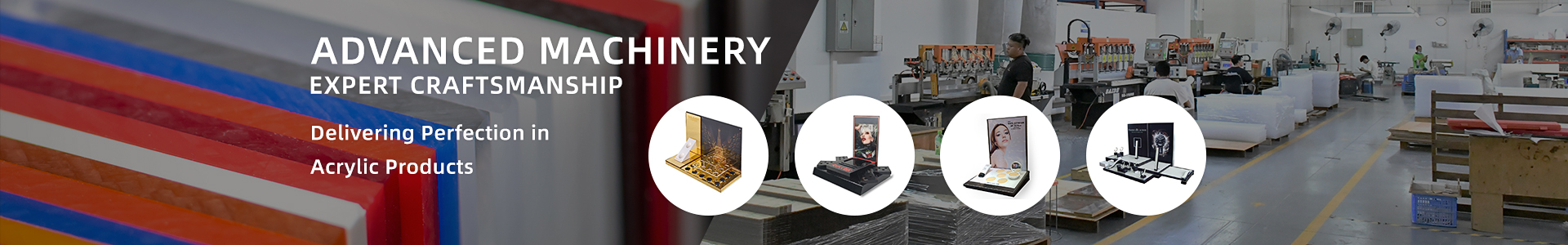
Acrylic & Plastic Products: Manufacturers like TOYIN use Pantone color codes to custom-produce acrylic displays, storage boxes, and furniture that match brand colors precisely. For example, when a global brand requests a custom acrylic display rack, TOYIN formulates and tests pigments to match the specified Pantone color, conducts sample approvals, and controls each production batch for consistency (ePlastics PMS Color Matching Table).
Signage & Retail Displays: Guarantees that signage colors remain consistent across different locations and materials.
Textiles & Fashion: Used to standardize colors in fabrics and accessories.
Special Note: Achieving perfect Pantone color matching on acrylic requires expertise, as the material’s transparency, thickness, and surface finish can affect color perception. Manufacturers must conduct thorough testing and may use Pantone’s plastic color chips for direct reference.
Related Concepts
CMYK: A four-color process used in printing, less precise than Pantone for spot colors.
RGB: Color model for digital screens, not suitable for print or physical products.
Spot Color: A single, premixed color used in printing, often specified by Pantone.
Color Management: The process of controlling color consistency across devices and materials.
RAL Color: Another color matching system, mainly used in Europe for paints and coatings.
Visual Aids
Color matching process diagrams (recommended for further reading)
Learn More & Custom Solutions
If you need custom acrylic products with precise Pantone color matching for your brand, Toyin Acrylic Products Co., Ltd. (TOYIN) offers expert design, manufacturing, and global delivery. Explore our custom solutions or request a quote today!
